The art of stamp collecting
I will use this discussion topic in the coming weeks to share philatelic images I've created over the past several years.
I stopped collecting stamps over 20 years ago. I had realized that designing informative and visually interesting album pages was more fun (and cheaper!) that collecting the stamps. My experimentation with album page design led to my creating a few prints to sell as well as several digital designs that I created just for fun. I was already proficient in the use of the Photoshop software and used for much of this work. (I also used Microsoft Publisher and Coreldraw in the beginning for much of the album page design work.)
The title of this HipStamp discussion is based on my American Philatelist article that was published in their June 2011 issue. That six-page article displayed examples of album pages and prints I had created. I'll use this discussion to share some of those images along with other work, including digital framed stamps and some design elements that have never made it into any design project.
Tom
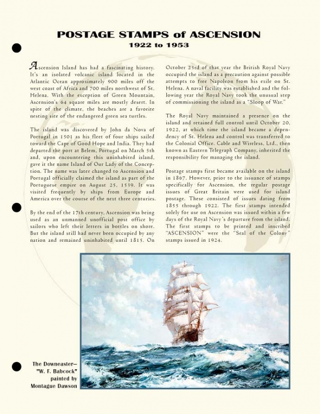
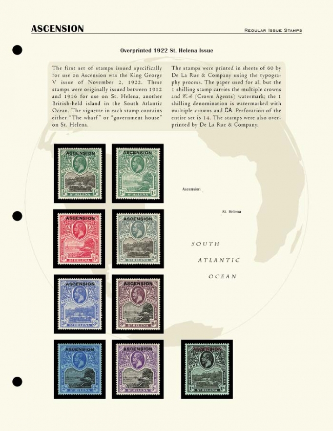
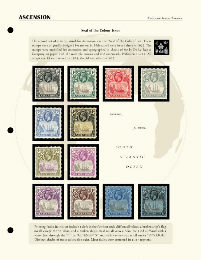
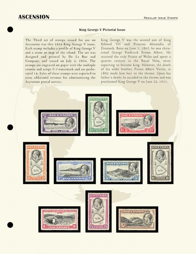
The following are the first four pages of an Ascension collection. These pages are designed for a three-ring binder, but I also experimented with a design for Lindner T-blank pages. I didn't photograph or scan the pages themselves to create these page images. The stamps had already been scanned separately and I placed the stamp images individually on the digital pages using Photoshop to demonstrate how they would look.


Comments
Please show more!
More will be coming..................
The second image shows the stamp vignette, much enlarged, as the centerpiece of the print. The stamp and the name tablet from the stamp are the other two elements of the design. I never actually finished way back when, but spent some time making it more presentable today. The size of this piece is 8.5 by 6.25 inches, but it would probably require additional refinement before printing.
For those who haven’t yet noticed, this set of stamps was a favorite of mine!
I did this Norway print simply because I had this letter with stamps that Dad gave me when I was a kid. He never collected foreign stamps and he didn't remember where he got the letter. The stamps on the letter were from the early to mid 1940s and mostly related to Norwegian culture. However, I needed something else for the print from the same era and found the 1941 mint set of Scott 240-245. The Norwegian map and flag images rounded out the elements for the print. The print size is 12 by 18 inches, designed for printing on standard 13 by 19 inch paper.
Hal, I haven't collected stamps for several years. The stamp images you're seeing here in this discussion, both the images of the album pages and the prints, are digital representations of the original stamps from my collection. Except in the case of the album pages, these stamp images are enlarged from the original sizes. When I collected, I collected mint stamps and never used hinges. I tended to buy old collections and some of those included nice pages with the lined area for the stamps. Sine if those collections used mounts and some used hinges. As far as the hobby ever returning to the use of graph paper type pages, I think the availability of of nicer production pages and the ease of printing the Steiner pages make a return to those old days unlikely. However, there is nothing to prohibit anyone from arranging their collection on any type of page they want. Some of those old collections I bought looked very nice on those graph paper pages.
In the 1990s, I had stopped acquiring stamps and then later was trying to decide how to sell my stamps. In 1999 and very early 2000, I was experimenting with graphic designs that might be useful in that sales effort. That experimentation resulted in these four mock-ups. They are larger than they appear here—17 by 11 inches— but could be reduced to any suitable size. I started selling on eBay a few months after creating these and opened my store at StampWants late in 2006, but never used anything like these to sell my stamps. I didn’t even make test prints.
My collecting focus was pre-1940 colonial Africa and (to a lesser degree) pre-1940 Caribbean, but I acquired many, mostly engraved, odds and ends that were appealing. My Ascension collection (1-39 complete) was associated with the colonial Africa focus. I really liked the Ascension stamps and the island had a unique history. I first became aware of Ascension back in 1966 when the BBC set up their shortwave radio relay station on Ascension to enable better reception of BBC programming in the southern hemisphere.
The other three display cards represented items outside my collecting focus. I purchased these items because I was planning a series of prints based on stamps and postal history. I thought each of these would be ideal elements in various prints I was considering. My strategy was to buy the items when I could get them at good prices, then scan them and resell them to recover the cost. That strategy worked well sometimes and sometimes it didn’t.
The Zeppelin postcard with the Scott C40 airmail stamp and the Switzerland Scott 185 stamp were never used in prints.
I don’t remember how I first learned about the Japan National Parks stamps and souvenir sheets, but managed to accumulate a few of these fairly quickly. I was attracted to this series because of the subject matter. In addition, the souvenir sheets and folders would make great additions to any Japan National Parks print designs I might want to create. In my next post, I will present an example of this type of print.
For this design, I used the 1938 four-stamp Nikko National Park set (Scott 280-283) at the top of the print. The set at the bottom is the 1939 Aso National Park set (Scott 290-293). In the print’s center, the souvenir sheet (Scott 288a) and image of the folder for the souvenir sheet are also from 1939. The stamps in this souvenir sheet represent Daisen and Inland Sea National Parks.
For both of these images, the white border represents the unprinted paper edges that customarily would be hidden when the prints are matted and framed for display.
The third image was created especially for an article, “The Art of Stamp Collecting,” that American Philatelist published in their June 2011 issue. The editor was going to use this as a two-page layout, but available space in that issue was limited and the size reduced significantly to fit available space.
Tom
Tom
I had purchased a mint Sudan collection in the late 1980s or early 1990s. It was fairly complete through 1954. A few stamps were in mounts, but most were lightly hinged. The examples you see below were printed and inserted behind the clear sleeves of the T-blank pages. Everything you see on the first insert — the title, map, stamp boxes and text — was part of my design. The second page is a digital representation of an insert overlaid with digital images of the stamps to show how it looked in the album.
The computer files for these inserts were created in CorelDraw in 1996 and later exported to Photoshop. I think the initial versions were created in Adobe Pagemaker two to three years earlier. When Adobe stopped updating and supporting Pagemaker (mid to late 1990s?), I continued using it for a while, but relied more and more on CorelDraw for some aspects of design and later began using Microsoft Publisher software to some extent after it was significantly improved.
In 1996, affordable high quality inkjet printers for personal use didn’t exist. I had a Lexmark laser printer and could print any color I chose as long as I chose black. However, the laser technology was dangerous when it came to stamps and other items that needed to be protected and preserved. The technology was unsuitable for album pages, even if the stamps were not in direct contact. I had to wait for inkjet printers to arrive before I could use my inserts.
Two years later, I was focusing on color work and color inkjet printers were coming onto the market. Inkjet output initially looked good on paper, but the inks were unstable. A few small niche businesses arose to sell add-on equipment and custom archival pigment inks for use with those early inkjet printers. Soon after, third party refillable cartridges appeared on the market. They could be filled with custom inks. Both technologies were messy and prone to technical problems, but Epson began selling inkjet printers with much improved inks after the turn of the century. That innovation, along with general improvements in paper quality, set the stage for the higher quality album pages we can produce today.
Tom
I used several sources of information in developing the text. These included Michael Doyle’s book, Empires, Thomas Pakenham’s The Scramble for Africa, Adam Hochschild’s King Leopold’s Ghost, and H. L. Wesseling’s Divide and Rule: The Partition of Africa, 1880-1914. Given the political and geographic complexity of this period in Africa’s history, I can’t guarantee the accuracy of this text. So, I recommend you do your own due diligence when trying to sort out Africa’s colonial history.
The HipStamp size limit for images makes the text on these pages somewhat difficult to read. I extracted that text and have presented it below each page image for those who may be interested.
The Sudan is a vast, vaguely defined region of North Africa, located between the Sahara Desert and the rainy tropics. Egypt conquered northern Sudan in 1820 in an attempt to extend its influence south along the Nile. British and French interest in this area was already increasing when the Suez Canal opened in 1869. Unrest in the Sudan, triggered by the slave trade, mounted steadily during this period and in 1873 the Egyptians appointed British general Charles George Gordon as governor of Egyptian Sudan. A local military leader, Mohammed Ahmad, proclaimed himself the Mahdi, a traditional Muslim figure chosen to lead the jihad, or holy war. The Mahdist Revolt began in 1880 and took complete control of the Sudan in the early 1880s. However, living conditions soon deteriorated as a result of incessant warfare, including a failed attempt to conquer Egypt.
Egypt was now almost totally controlled by Britain. A British - Egyptian military expedition defeated the Sudanese at Omdurman in 1898. Rather than turn control over to the Egyptians following their victory, the British signed the Anglo- Egyptian Condominium in 1899. This agreement created a separate political status for northern Sudan, with control shared by the British Crown and the Egyptian government.
The race for control of southern Sudan between the British and French ended in a military confrontation at Fashoda in 1898. War was avoided in a bilateral settlement that left eastern portions of the Sudan to be ruled jointly by Britain and Egypt, while France was to control Chad and the western portions of western portions of the Sudan. When the governor-general of Sudan was assassinated in Cairo in 1924, the British forced the Egyptians from the Sudan. The Sudan became self-governing in 1954.
AFRIQUE OCCIDENTALE FRANÇAISE (AOF) was an administrative grouping of the French territories of West Africa from 1895 until 1958. Its capital was on the coast at Dakar, Senegal. The territories ultimately included Dahomey, French Guinea, French Sudan, Ivory Coast, Mauritania, Niger, Niger, Senegal and Upper Volta. However, the names and configuration of this broad territory changed several times during the French administration. For example, in 1899, the French Sudan was divided among Dahomey, French Guinea, Ivory Coast, Senegal, and Senegambia and Niger. Certain territories of the French Sudan were grouped together in 1903 under the name Senegambia and Niger (Sénégambie-Niger), and were consolidated in 1904 with part of the French Sudan into Upper Senegal and Niger (Haut-Sénégal- Niger). Mauritania (”Maurétanie”) was added to French West Africa at about the same time.
The colony of Upper Volta (Haute-Volta), founded in 1909, was initially attached to the Ivory Coast, but later was incorporated into Upper Senegal and Niger. It was detached from Upper Senegal and Niger in 1919 and then divided among French Sudan, Ivory Coast and Niger in 1933.
Upper Senegal and Niger was renamed the French Sudan in 1921, and then Niger was formed into a separate colony in 1922..
Stamps were first issued in the territories for Senegal in 1887. The French government began issuing stamps for French Guinea (”Guinée Français”) and the Ivory Coast (”Côte d’Ivoire”) in 1892, and followed suit for the French Sudan (”Soudan Français”) in 1894. Although Dahomey was annexed in 1894 and incorporated into French West Africa in 1895, the first stamps were not issued in the name of Dahomey until 1899. Stamps in the name of ”Maurétanie” were first issued in 1906. Stamps for French Sudan were not printed between 1900 and 1921. Stamps for ”Territoire du Niger” were not printed until 1922.
By 1960 the former colonial territories had all become independent republics, with French Sudan changing its name to Mali. Niger was proclaimed a republic in 1955. Senegal, French Guinea, Mauritania, Upper Volta and Dahomey became republics in 1958. The Republic of Senegal and the Sudanese Republic formed the Federation of Mali in 1959, but dissolved it the following year. It was succeeded by the Republic of Mali and Senegal. Ivory Coast became a republic in 1960. Dahomey changed its name to Benin in 1975, and Upper Volta was renamed Burkina Faso in 1984.
The French Sudan pages, like the pages for The Sudan, were created as inserts for Lindner T-blank album pages. I completed pages for Scott 21 (1921) through Scott 119 (1941) plus back of book through 1942 and Vichy government issues. I never had Scott 1 or 2 and I have never done anything with the Scott 3 to 19 stamps in the collection. I did not get pages prepared for those stamps.
I began disassembling the French Sudan collection a few years ago in order to scan and sell the stamps. What I have done here is recreate four of the original album pages from the original 1996 files. To do this, I opened and exported the old CorelDraw files to Photoshop. In Photoshop, I added the separately scanned stamp images to three of the page images (pages 7, 9 and 12) to represent how the pages appeared. These pages were then saved as JPG files for this presentation. The first page is presented without the stamps in order to show how the stamp boxes were laid out.
I've been very much appreciating your posts on this.
I haven't used Microsoft Publisher in over a decade and it was a struggle relearning it. I also struggled to find a way to create these digital versions of the final pages. I finally decided the easiest way was to copy and paste from Publisher to Photoshop. Since I had scanned the stamps into Photoshop a few years ago to sell, I could create the individual stamp images in Photoshop and and then place them on the "pages" prior to saving as JPG files. I left the stamps off of pages 3 and 4 to show the page designs more clearly. Again, I was presenting the stamps in chronological order rather than Scott numbers.
I had mentioned previously that I should have identified more specifically each subsection of French West Africa on my maps. I was thinking I should have, for example, highlighted Upper Senegal & Niger on the background map. Now I remember why I didn't do that. Try finding an online map of the boundaries of Upper Senegal & Niger! The shifting boundaries of the French West Africa territories were a complicated mess.
I've seen some great examples here in the HipStamp forums of very nice pages others are developing. It's a great way to enhance and distinguish individual collections from all the others. I hope to see more examples of others' work.
Dave, I tend to be verbose when I start writing!
Edit: I should add that the text looks much, much better in the original MS Publisher format and on paper. The moving of the original digital pages from Publisher to Photoshop and then the reduction in page size required by HipStamp takes its toll on the readability of the text.
Tom
Unlike all the other album page images I have posted, this image was scanned from a printed sheet of paper. Although I worked on a set of St. Helena pages with Scott stamp numbers, they're in the old Adobe Pagemaker format and I don't have a convenient way of opening those files.
The Queen Victoria medallion on this page was cropped from an 1898 stamp, but I didn't document which one. I scanned the stamp at high resolution, cleaned it up and added the drop shadow in Photoshop. I then reduced the size of the image and altered its color for use on this album page.
Tom